Design Problem:
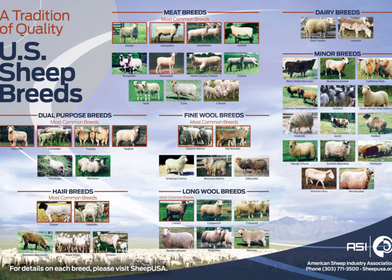
The American Sheep Industry Association (ASI) needed a brochure catering to sheep producers, the public, and the media. The existing booklet was just a reference, and the design and format were not mandatory. The primary goal was to have a contemporary and consistent layout that reflected the organization's identity and principles.
Design Solution:
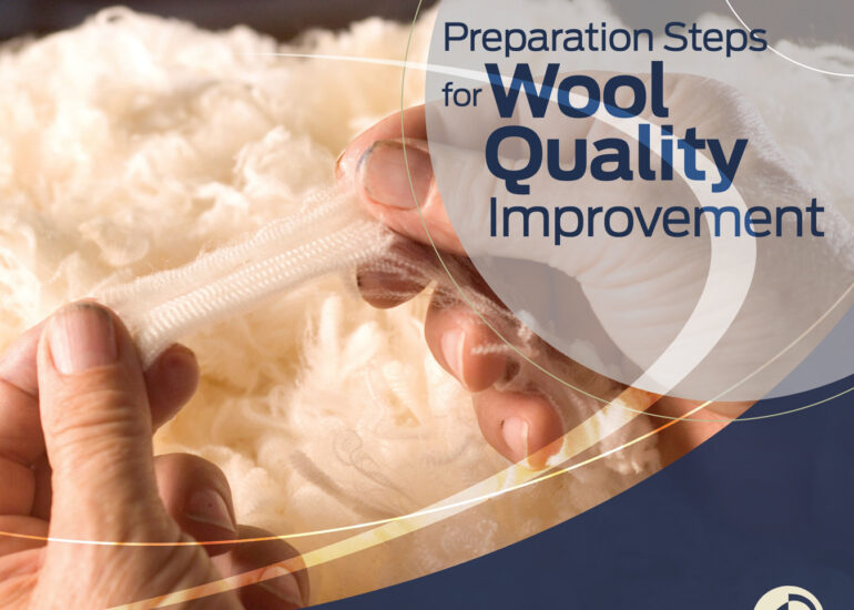
As the project's art director and graphic designer, I created a 12-page color brochure in a 9"x8" format with a print quantity of 500 using a 4-color offset press. I sent out four printer bid estimates. In the end, ASI decided to go with the regular printer they had been using. I merged graphical elements from past projects to ensure consistency with ASI's promotional materials.
The design I created was simple yet impactful, with a focus on visual hierarchy and readability. I utilized bold typography and high-quality images to capture the audience's attention while conveying crucial information about ASI's mission, objectives, and initiatives. The color scheme was inspired by the organization's logo and brand guidelines.
- Photoshop
- Illustrator
- Indesign
- Acrobat
American Sheep Industry Association (ASI)
Results:
The new brochure was well-received by ASI's target audience, including sheep producers, the public, and the media. It effectively conveyed ASI's message and provided valuable information about the organization's work and impact. The modern, clean design was a significant improvement over the old brochure and helped establish ASI as a professional and trustworthy organization.
The brochure was also used as a model for future promotional materials, ensuring consistency and brand recognition across all ASI communications. Overall, the new design successfully developed a consistent look for ASI's materials and helped the organization better connect with its audience.
Thoughts and comments on this design
This project was a challenging yet rewarding experience. It spanned several months due to the multiple rounds of approval it had to go through with different committees and upper management. However, the changes requested were mostly straightforward, and it was interesting to see how they evolved over time. The biggest challenge was incorporating the client's brand colors while still maintaining a modern and clean design. Overall, I am proud of the final product and believe it effectively conveys the desired message to its intended audience.
